We are happy to welcome you to our brand new online store! All your favorite products are there as well as new ones. We are always keen to improve your online experience! We have therefore developed this new store, with more features in a more attractive universe. Among our new features is… As you have surely already noticed, our logo is also getting a makeover! We wanted to take you behind the scenes of the creation of our logo.
The Au Savon De Marseille logo is elegant and inspiring. It is composed of a logotype and a symbol.
THE SYMBOL
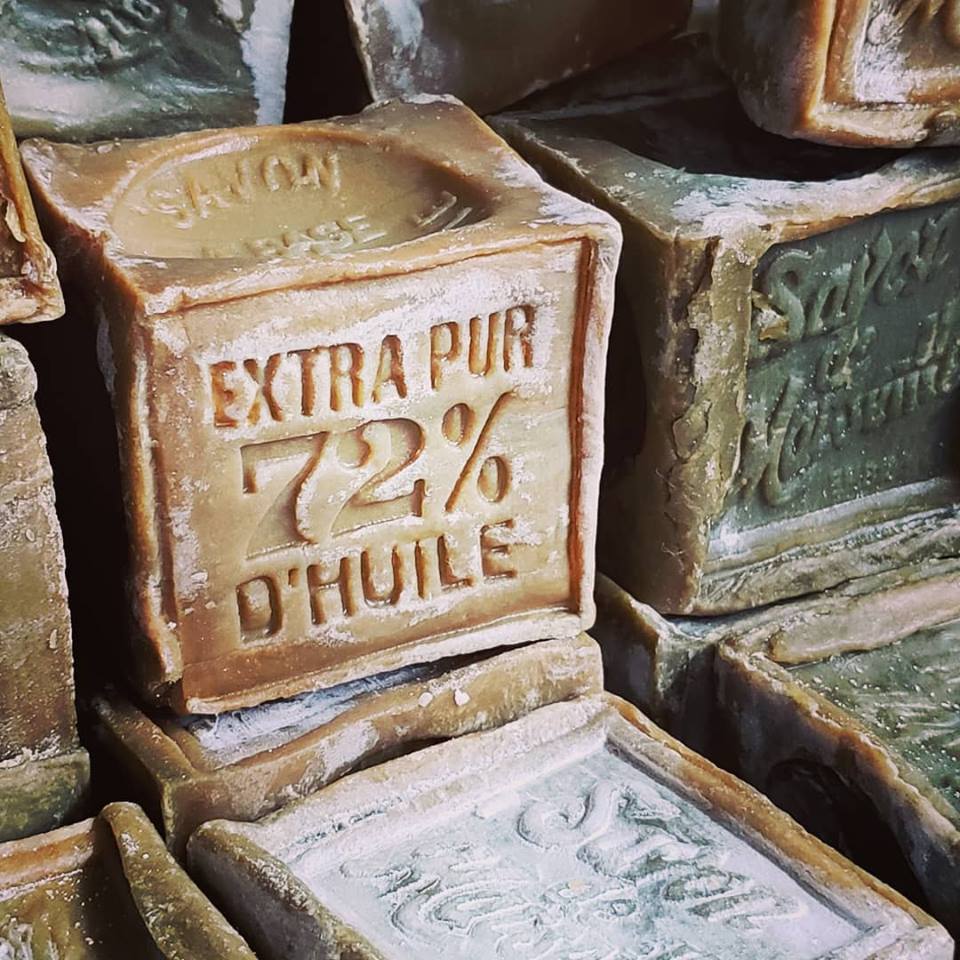
We wanted to have a symbol representing our company. We have therefore decided to honor the olive which is the very essence of Marseille soap with its composition of 72% olive oil. The O with its leaves therefore evokes the well-known olive of the famous Marseille soap.
BRAND COLORS
The colors are inspired by the beautiful France, country of origin of our beloved soap. The blue is a reminder of the water in the ports surrounding the city of Marseille, the awnings and also symbolizes loyalty to old traditions. Red and white then complete the range of colors bearing the image of the French flag.
THE TYPOGRAPHY
The typography for the logotype is the union of two fonts. The Goldensmith cast iron has a slightly faded vintage feel, to bring the authenticity and raw aspect of this legendary soap. The Bodoni cast iron recalls the elegance and fame of the product.
We hope your experience on our store is enjoyable!
